Does your brand strategy fit your brand?
In the context of this article, the term "branding" or "brand strategy" only refers to the visuals you are using to communicate your company's brand - in other words, the "look" you are using to visually support and communicate your message. Your company may not have been through a formal brand development process. Or maybe you have a brand, but you're unsure as to whether your visuals are doing the best job possible communicating your message.
Let's do a simple exercise. Keep in mind, it's not science, and may not work in every instance, but it has come in handy to show clients when they haven't been making full use of their available resources.
Look at an ad or other simple visual you have recently produced using your current "look". Think about your brand or "identity". Who are you? What are the unique qualities that you use to attract potential customers? Why do people choose you over your competitors? Then think of a company, product or service that is NOT AT ALL like yours. For instance, in the tourism sector, if you are in a more rural locale, choose a big city with all the glitz, a beach city, or somewhere that has dramatically different landscaping or attractions. Find photos in a magazine or by doing a Google image search. Drop these photos into your ad instead of the photos you are using. Does your "look" still work for this new destination? Or even kind of? If your answer is yes, then your branding strategy needs work to more clearly define and communicate who you are. Even if you pick another area that is somewhat SIMILAR to yours, and it looks "fine", then not enough has been done to highlight the uniqueness your destination has to offer.
The following example is the branding of a destination. However, the same concept can be applied to any business or industry.
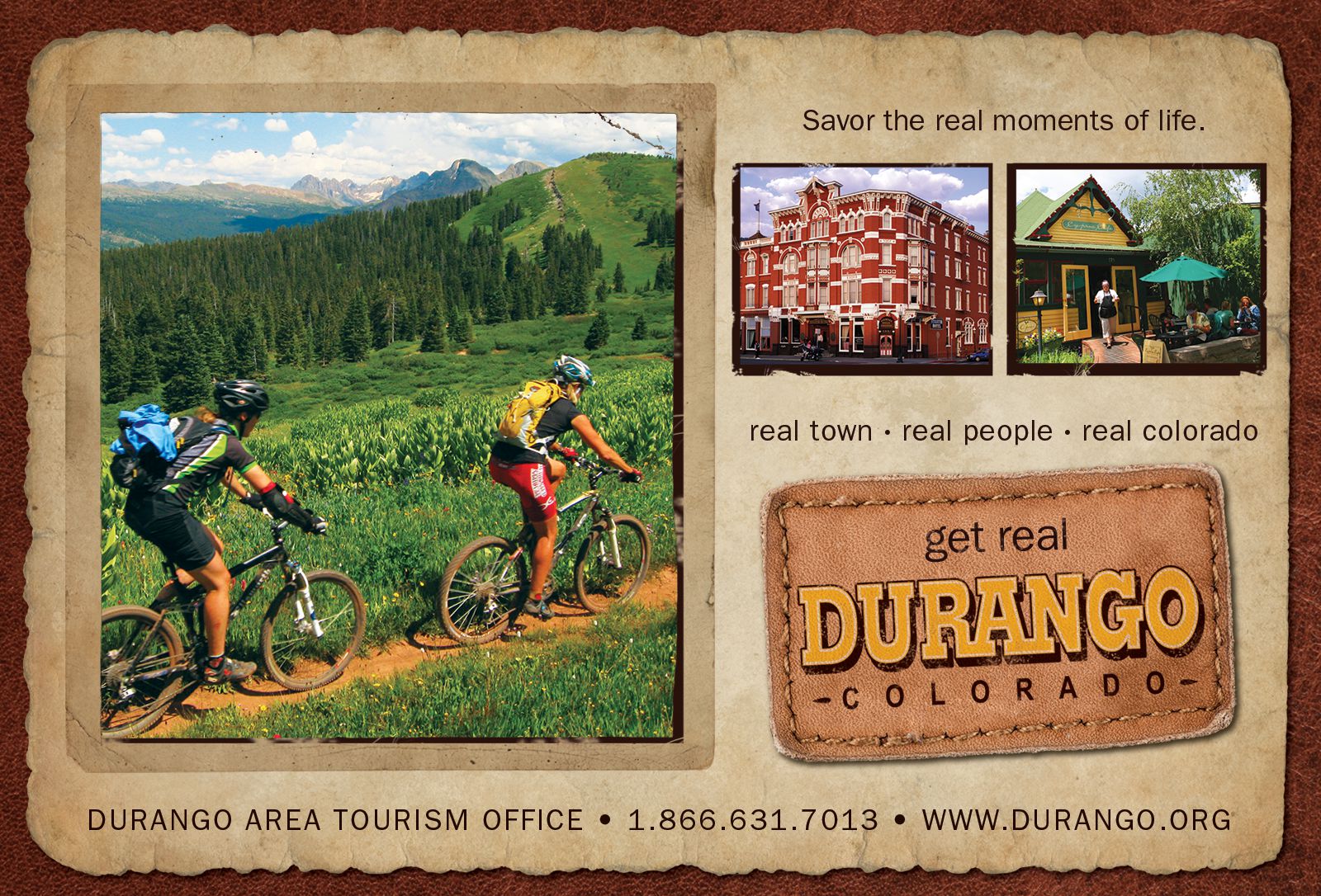
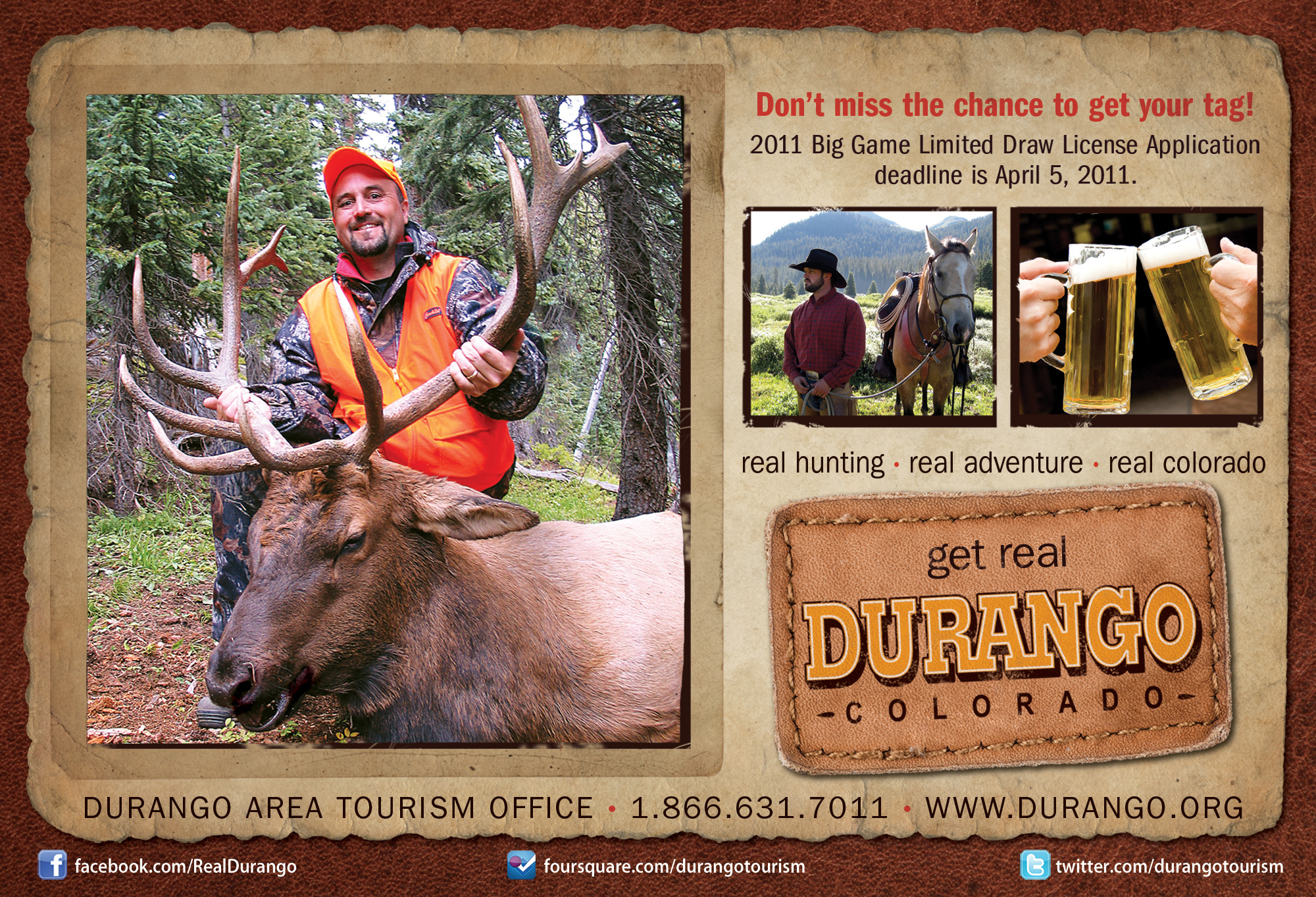
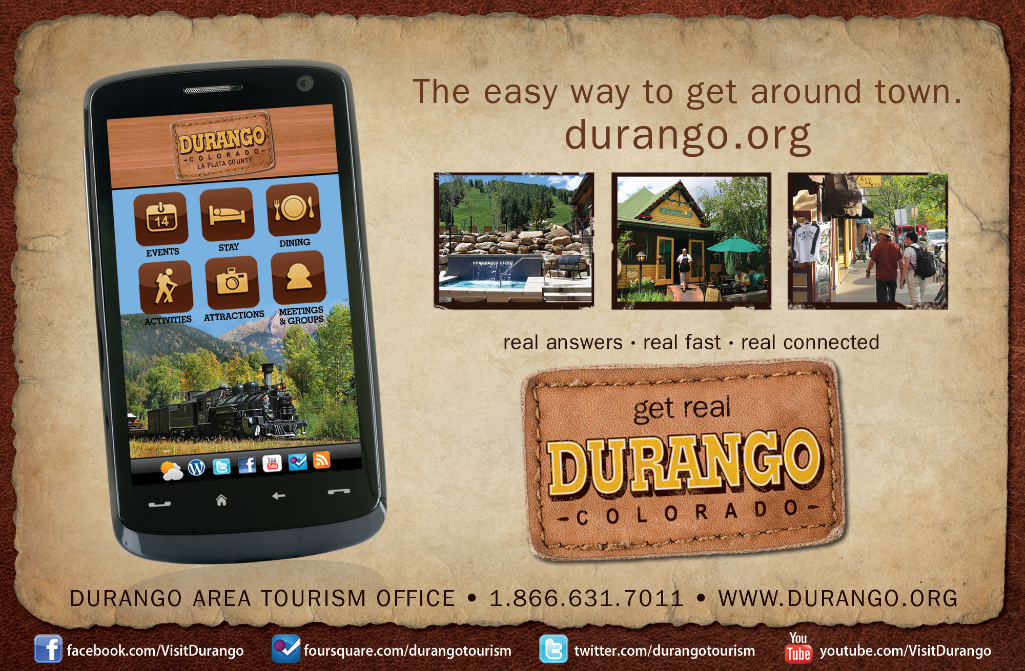
"REAL" Example - Durango, Colorado:
When the Durango Area Tourism Association hired me in 2007 for print advertising, they already had developed a brand. The problem was that is wasn't being conveyed effectively, visually or otherwise, thus creating some confusion.
The positioning statement they were using was "Get Real". Visitors indicated that one of the main reasons they choose to visit time and time again is that the area feels very inviting, authentic and down to earth. However, some people felt that statement seemed pretentious. So to avoid sounding condescending, the statement required qualifiers to always be present. Instead of scrapping the positioning statement and starting over, we allowed the challenge to create opportunities to be creative, playful, and ever-changing to fit each target market or advertising purpose. Real History, Real Adventure, Real Memories, Real Culture, Real Mountains, Real Colorado, Real Vacation.... you get the picture.
Take a look at the visuals they were using before they came to us:
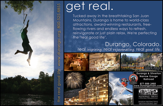
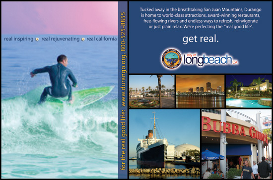
To demonstrate how their current branding, or "look", was not doing anything to support th uniqueness of their brand, I dropped photos and the logo from Long Beach, California into one of their layouts, and guess what? The mediocre branding tactics they were using also worked for a beach city that has absolutely nothing in common with a town with all the "Old Wild West" history like Durango.
So it was time to get down to the "real" issue.
Problem 1:
The qualifiers to the "Get Real" positioning statement were getting lost. People were still not "getting it" and were under the impression that Durango was giving off pretentious aires - the exact opposite of the intended objective.
Problem 2:
Nothing in the look conveys what Durango is about. Even though it's a mountain town that's real and down to earth, nothing will take away the fact that Durango has deep roots in the old west. Everywhere you look on Main Ave, the architecture underscores it with old time facades and historical buildings. Black and white photos of the good ‘ol days are still on display in many an establishment. The historical narrow gauge train whistles can be heard all through town, all day, right on schedule, along with every type of live music, including banjos and player pianos. The combination of the majestic scenery, a plethora of unique outdoor activities and American history is what draws tourists from all over the world. So why not integrate an old west, rustic feel into the new branding tactics?
The solution, which created a visual vehicle that could be used for a variety of target markets: